

Ilargi posted this chart today at The Automatic Earth, with the advice
My friend Francois sends this graph from the St. Louis Fed. I suggest you take a good long hard look:
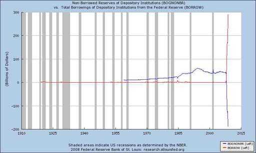
In case it's not evident, the red and blue lines fly off the chart for lack of scale. The original post links to a full size image.
Trying to find out what exactly "bognonbr" is ("Non-Borrowed Reserves of Depository Institutions") I get equally puzzled/alarmed postings at kitco, gotinflation.com, what have you.
Money Matters: Strange And Scary Federal Reserve Charts!

The main thing here is, both the 9/11 spike and the present collapse are UNPRECEDENTED. They are very destabilizing and are indicators of something very twisted and out of ordinary. Any way we look at this, it is terrible. It is also obvious that this crisis is much worse than the one that brought into being both the Bretton Woods II and the Plaza Accords. I sometimes read officials musing about the possibility of solving this mess via such a meeting but it never happens since it means China gets to dictate some terms to us in exchange of changing the value of the yuan. Namely, we have to live within a strict budget.


